P7: Integrate the scripted character with the storyline to create the final product
Hope World by Beth Rands on Scribd
M3: Manipulate the visual appeal of the comic to clarify meaning
Self-evaluation:
I believe in terms of how well I stuck to the proposal, I followed it very well. The script is almost exactly the same (except for a few grammatical errors I corrected), the panel layout is exactly as I planned it in P5 and I made only a few minor changes to the storyboard. I also used the same font and types of speech bubble I planned on using, along with the style of sound effect I decided on. I made the changes to my graphic novel that I did because either the pose I had chosen in the storyboard wasn't accurate to proper anatomy, or I made the design a bit more detailed (i.e. the shop front and the panel on the Underground). I believe that the changes I made improved my novel and made it more enjoyable for the reader, as the scenery panels are now more interesting to look at, and they help to show the audience what time of day it is from the shades of grey I used.
In terms of target audience, I think my original idea of 15-19 year old girls still fits the graphic novel, but it could maybe be extended to 13-24 as my main character is 20, which is older than the original age bracket I had in mind. This means that that age group can't relate to her as well as they could if she was 16-17, as the original target audience don't know what it's like to be 20. However, I think a 13-19 year old audience can still relate to some of the issues she encounters, and can still be entertained by the graphic novel.
If I were to make any changes to Hope World, I would like to re-draw some of the panels that didn't turn out as well as I pictured, or ones that are a bit rushed - like the panel of Ten standing outside the bar. If I had more time for this unit, I would like to have added more detail to the background of every panel and draw out the scenery fully to make it more immersive for the reader. I don't feel that I need to change any aspects of the narrative or the text, because I feel that the plot is a suitable maturity level for the target audience, and that the text is readable on screen. However, the target audience may feel like there are some other things that need changing that I hadn't identified, which I will find out.
Considering Readability:
To assess the readability of my graphic novel, I will be using the Flesch Reading Ease scale and the Flesch-Kincaid Grade Level. I am using two different methods because the Reading Ease scale is seen as being a safer bet in terms of generating reliable and valid scores, but the Flesch-Kincaid Grade Level results are much easier to interpret. My Flesch Reading Ease score is 90.3, which is the same level as a student in Year 7 and is categorised as "easy to read". My Flesch-Kincaid Grade Level is level 3, meaning that students in Year 4 can and up can read my graphic novel. This means the sentence lengths, types and words used are suitable for my target audience, however there is room for me to increase the score to make my graphic novel suitable for a slightly more mature audience.
Audience Feedback:
I will ask my focus group the following questions about my graphic novel after they have read it:
- Do you feel that the art style fits with the tone/genre of the graphic novel?
- Is the text easy to read and understand?
- Is there something about any of the panels you would change?
- Would you change anything about the narrative/pacing so far?
- If you saw Hope World in a shop would you pick it up?
In response to these questions, this is what my focus group had to say (paraphrased):
- The group said yes, the art style helps to tell the story - and since the graphic novel is dystopian, the black and white fits with that tone and makes it more abstract.
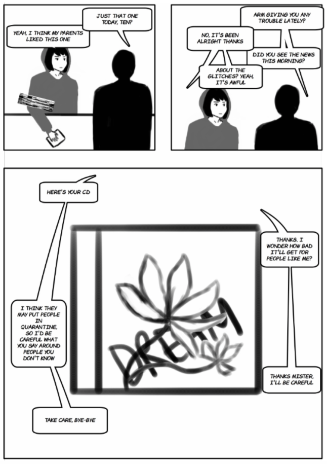
- This was a yes on the whole, however, one member of the group said that in panels 3.2 and 3.3 (talking to the shopkeeper) the text bubbles are confusing. They suggested swapping which side the speech bubbles are on in panel 3.3 to keep Ten on the left hand side and the shopkeeper on they right. They also suggested changing where the tails of the speech bubbles go in panel 3.2, as it looks a bit messy.
- Most people were happy with the panels as a whole, but it was suggested that I darken the background of some of the panels (particularly 2.2, 2.3 and 2.4) to keep the setting and time of day consistent.
- One person said that the ending was a bit abrupt, but when I explained that the section I produced was just a sample and not the full first issue, they said the pacing was understandable. The group agreed that the pacing helped to tell the story well. Another group member suggested that another time, I could split panel 3.2 into two panels, as the panel next to it is the same size but has much fewer speech bubbles in it.
- Everyone in the focus group said that they would be intrigued by Hope World if they saw it on a shelf. One person said the black and white cover would help it to stand out from the other comics and be eye-catching. Another group member said that it is the type of graphic novel they already enjoy reading, so they would definitely be drawn to it as you can tell it is from the cyberpunk genre from the front cover.
I am willing to take all of this feedback onboard and will make the appropriate changes.
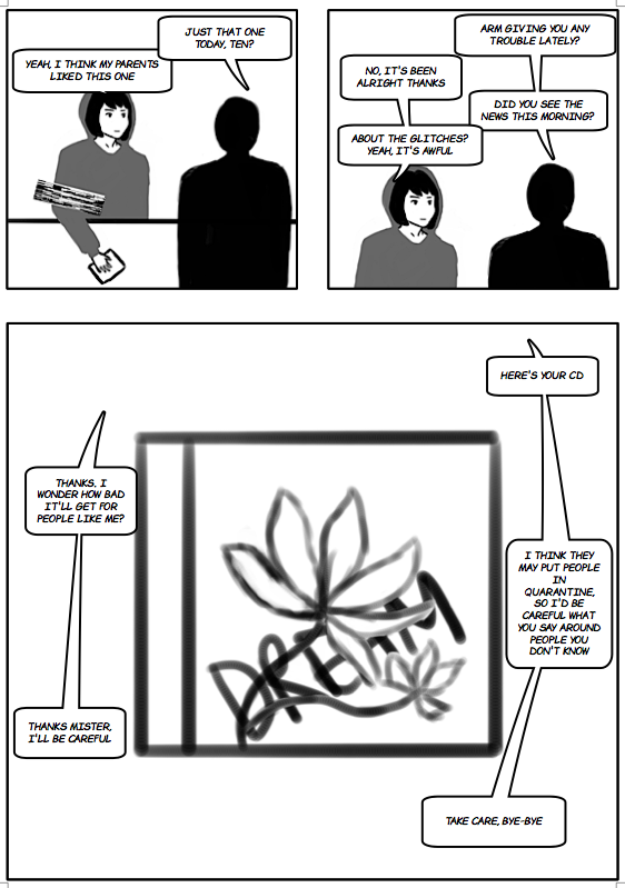
Before: After:
|
|
Above is the improved page 3. I have switched the text over on the bottom panel to make it clear who is speaking and I have changed the speech bubbles in the second to make it look neater.
Before: After:
|
|
D2: Justify how the visual style of the final product follows the conventions of graphic novels or comics within its genre
Consideration of images used:
The images in Hope World are drawn, which is a convention of comics and graphic novels, photo stories tend not to be as popular with older audiences so I chose to use drawn images. However, I drew my entire graphic novel using a graphics tablet, because this was easier for me but mostly because this is becoming a convention of more and more graphic novels and webcomics, so it is what the readers expect to see. All modern comics and graphic novels tend to have the formatting, panelling and text added in digitally, so this is also a convention I have conformed to. I thought about writing the speech bubbles myself, but realised that my handwriting on a graphics tablet isn't very neat, so I decided to type it.
I modelled my imagery after Maus, as after analysing this graphic novel, I realised how effective the artistic techniques are, and it was written by someone who is an author rather than an illustrator, so it gave me faith that I could use a simple art style as a novice artist and still tell a compelling story. Maus also is in black and white, and similar to Hope World, it has more text than pictures in some places, and I did this deliberately to try and have the same sad tone. I also chose this imagery because the superhero genre is very popular at the moment, so there are lots of bright, primary colours on a shelf of comics, so my front cover will be different from those and could actually be more eye-catching on a shelf to people looking for something unique.
I chose this style of drawing people because it is how my style has developed after practicing drawing for the past few months. I feel like it is detailed enough that it shows character's expressions and is immersive, but is simple enough that I will be able to complete it in time.
Colouring:
I chose to use colouring that isn't conventional of comics and graphic novels by making my entire graphic novel in black and white. For most comics - particularly in the superhero genre - they use lots of bright colours to be more eye-catching, and often use colour theory to connote/foreshadow what a character is like. For example, use blue and green clothes for a good character and red and black clothes for a bad character. Bright colours are also used to keep the attention of a younger target audience.
I chose not to conform to this convention because my graphic novel is more gritty and dystopian, so I wanted the art style to reflect this. It wouldn't reflect the mood of the novel if I used lots of bright colours, I want to connote through colours that Hope World deals with quite dark themes and is a more serious novel. I took inspiration from Maus, as it has a very simple black and white art style, and in my opinion that makes readers pay more attention to the story and the words on the page, rather than looking at the pictures. I wanted my images to be more of an aid to the story, rather the whole story being told through visuals.
In terms of colouring of the environment, it is common for a lot of the action to take place in one city, country or planet - for example, most of the action in the Batman comics takes place in the fictional Gotham City. I conformed to this convention because the readers can feel more connected to the characters if they are familiar with where they live - they will feel more as though they are a part of that world. I want the readers to feel like they are part of this drab and dreary world, where there is no sense of hope, and so the black and white style reflects this. I thought about using black, white and red as a colour scheme but decided not to as I thought this would make everything look very evil - as this is what the colour red connotes.
Fonts:
I used a font called 'Comic Chuck' consistently throughout my comic, for both normal text and for sound effects. I chose this font because it is the same type of font that is used in the vast majority of comics and graphic novels, and all the text is in all-caps as this is a convention of graphic novels. I varied the size of the text depending on how much space there was in a panel, but stuck to a range of 12-16 to make it fairly consistent. By using the same font and size throughout my graphic novel, it makes it look professional. This font is also very easy to read, so the graphic novel can be read by people who are learning English as a second language, so this broadens the readership.
Story flow:
Todorov's narrative theory states that almost all media texts have a narrative structure that is as follows: Equilibrium --> Disruption of equilibrium --> Recognition of the disruption --> Attempt to repair the disruption --> New equilibrium. My graphic novel follows this structure, as all graphic novels and comics do. However, a lot of comics will have the full narrative arc contained within one issue, but since I am creating a graphic novel, their main narrative convention is that the story carries on through multiple episodes. In this sample I created, I have set up the beginning of the disruption stage, so from the pacing of these first few pages, the reader can tell that this storyline will span over many issues of the graphic novel. This is conventional for graphic novels, as unlike comics they often have very long and complicated plots. I also wanted to pace my graphic novel in this way because it will bring in more dedicated readers who will be hooked in by the plot and will want to follow the narrative through many issues of Hope World.
Panel layout:
Panel layout is something that can vary greatly from comic to comic, and many different layouts are used throughout one graphic novel or comic, so it is difficult to decide what is conventional. I decided on my panel layout by sketching my storyboard and thinking carefully about what images and what text I want on that page. I decided on the size and shape of my panels by thinking about the story flow - for example on page 2, I put two panels of the same conversation on the same row, and then changed the shot to look down at the shop counter when the conversation was moving on to more serious things. I used large panels when I needed to include lots of text, and smaller, squarer panels when there was little/no dialogue or narration. This is because it is much easier for the reader to follow, and using lots of small panels makes the pace of the story move faster, and fewer boxes with lots of text slow the pace down.
Use of speech bubble/box placement:
Throughout my graphic novel, I made sure to keep all narration boxes and speech bubbles consistent in style, i.e. same font, same text size, same colour. This is important because the reader needs to be able to easily tell the difference between a speech bubble and a narration box, otherwise they won't be able to follow the story and it would look very unprofessional. For narration boxes, I used a simple black outline with square corners and for speech bubbles, I used a rounded square with a tail to show who is talking. I chose to have a simple white box with black text because this continues my black and white colour scheme, and it is very easy to read.
I often placed text boxes at the top of the panel, this is because I want the audience to read the text first and then look at the image, as the text is what moves the story along and gives context to what is happening in the picture. I used the traditional speech bubble shape because this is what the reader expects to see and is understood universally to show that a person is speaking, so they can understand my graphic novel easily.
Narrative perspective:
By using the square narration boxes, I have clearly shown that the story of Hope World is told from the perspective of Ten and is in first person. I wanted to do this because Ten is the main character and I want the audience to be able to connect with her, so if she gives some backstory in first person it will help the audience to get to know what she has been through and what kind of person she is. I wanted to write the narration in first person because this is a convention of graphic novels so regular readers of comics will be used to this.
Drawing perspective:
I decided to challenge myself by using perspective in a lot of my panels, rather than just drawing everything straight-on. This meant that I had to find a lot of reference pictures of buildings and human poses in order to make sure they looked realistic and accurate. Although these panels took much longer to create, I think it payed off because the audience will enjoy the variety of shots and angles used in the graphic novel and it is much more engaging to look at. Also, in professional comics and graphic novels, the artists have spent many years practicing their craft, so they are skilled enough to draw 3D objects from every angle, thus this is a convention of comics and graphic novels. By using perspective shots, it makes my graphic novel look more professional.
Symbols:
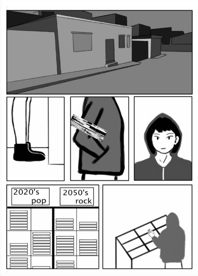
I used a few symbols in Hope World, as they can imply messages about a situation/character or can show foreshadowing and it makes the audience feel clever if they pick up on these signs. The most used symbol is the glitch - this connotes malfunction, flaw, mistake. I used this symbol because it symbolises how Ten has a setback in her life, and implies that a large part of the story will be about living with and attempting to correct this 'mistake'.
Another symbol I used is the snake from the bar called 'The Snake'. I wanted to include a snake because they connote suspicion, slyness, and lies, and these are all themes that appear throughout the graphic novel. Snake symbolism acts as foreshadowing and I included it to make the audience feel uneasy, and it also adds to the narrative by implying that Ten isn't in a safe part of the city.
The last symbol I used is the rat, which connotes disease, survival and uncleanliness. I decided to use a rat in my graphic novel because I wanted to show the audience in a literal sense that this is a dystopian novel, and I also wanted to foreshadow that glitched people in the novel will become like rats, having to scavenge and do anything just to survive, while being hated by the majority of people.
Sound effects:
Sound effects are a huge convention of graphic novels and comics, and they help to aid the visual aspect of the novel greatly, and they make the audience more engaged and immersed in the fictional world. The superhero genre uses sound effects more than any other genre, but because my graphic novel is sic-fi and it is aimed at a more mature audience, I have kept sound effects to a minimum. I decided to do this because I think the sound effects can sometimes look a bit childish, but I have still included some to meet the conventions of a graphic novel that readers expect to see. I also made the sound effects quite subtle (as they are usually in bright colours) for these same reasons, and also because the rest of Hope World has a monochrome colour scheme, so I wanted to stick to this theme.
I used sound effects in the panels shown below because they needed to assist the pictures to show what was going on in the scene. Without the onomatopoeia, the reader would be confused as to what is going on in the scene and may miss an important aspect of the plot. Since scenes aren't described with words in comics and graphic novels, sound effects are essential to fill this gap that cannot be filled with images.
