P4: Create the media components to be used in the planned campaign
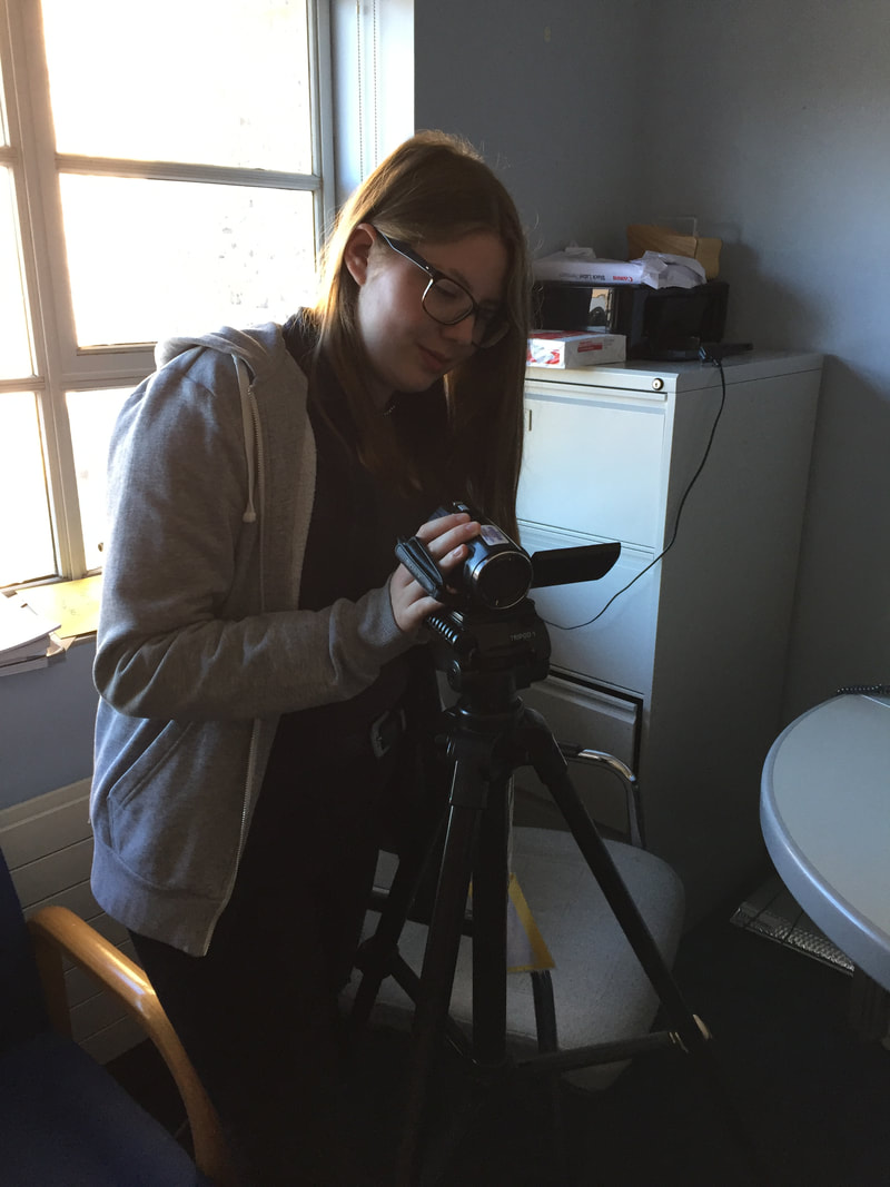
On the set filming the Envirobox advert.
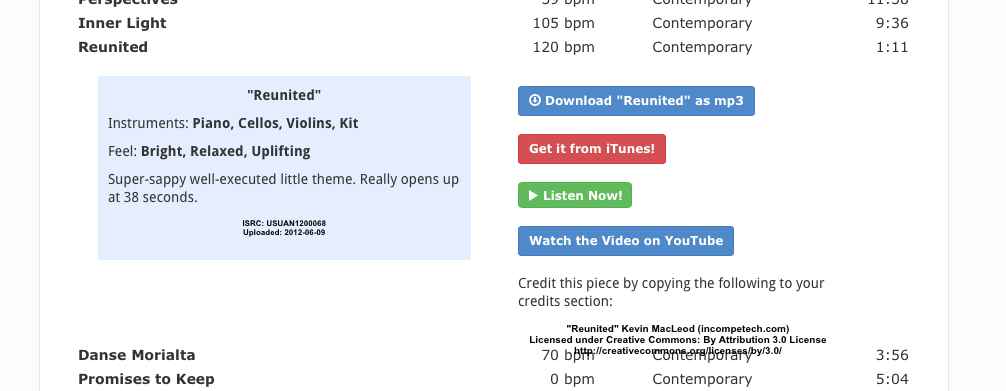
I found royalty free music on a website called Incompetech, the track I chose is called Reunited and it is an inspiring, bright song.
For my advertising campaign, the brief required me to create an audio-visual campaign, a flyer and a newspaper advert. To make these, I made the Envirobox prop myself, used school cameras, used Final Cut Pro to edit the audio-visual advert and used Microsoft Word to make the print advert.
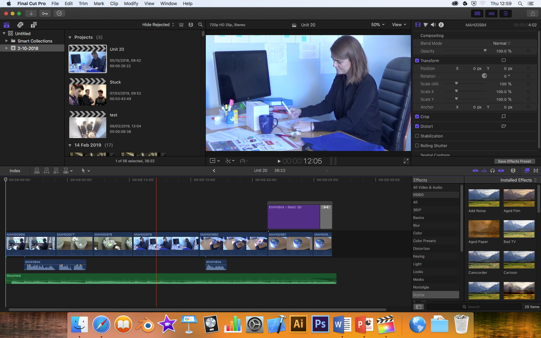
Below is a screenshot of what my editing suite looks like. I did everything in Final Cut Pro, as this editing was fairly simple to do. Along the bottom of the timeline is the song I used as a music bed to create a positive association with the product, and put the audience in a good mood. The other audio track is the voiceover, telling the audience that if they buy the Envirobox, they can be a lot kinder to the planet. In the final shot, I used some text on screen to clearly show the name of the product so it is more memorable. Showing this on screen also means that people who are deaf or hard of hearing can still get the message of the advert and aren't being excluded. At the end, I used a fade to black to clearly show the end of the advert, rather than giving it a sudden ending which would make it seem like there is more of the advert still to come.
Below is my flyer.
Envirobox Flyer by Beth Rands on Scribd
Below is my newspaper advert.
Envirobox Newspaper Article by Beth Rands on Scribd
M3: Explain how the created media components comply with the codes and conventions of the media sectors
The research into similar products on the market benefitted the making of my advertising campaign because I was able to clearly identify what was and wasn't successful. I found out that with food and drink products, it works very well to use colours like white, green and blue, especially if the product is advertised as being clean and healthy. Therefore, in both of my print adverts I used a lot of white to imply purity and cleanliness - I also made the Envirobox shown in the adverts white, blue and green. From watching adverts for similar products, and adverts in general, I decided that the most effective adverts for the type of product I have chosen are ones that have a clear message and show how the product can be used in everyday life. It is also a good idea to not create an advert that is controversial, as if people complain about it being offensive it could be banned altogether.
In newspaper adverts and flyers, the codes and conventions are to show the product and company name clearly, a tag line, show contact information, and have a focal image. So in my print adverts I made sure to include most of these features, I chose not to include contact information (e.g. a website address) because I thought this might be too much writing in one advert. Also, most people use search engines to find information they are interested in, so if they search for 'Envirobox' they will be able to find the website easily, especially since these are print adverts the audience would have to copy out the website URL rather than click on it if it was digital. I wanted the image to be the focal point of these adverts because the audience can easily see what kind of product this is at first glance and whether or not they would be interested. Using a image also draws your eye to this when flicking through a newspaper, and the next biggest thing in the advert is the name of the product, as the advert is only effective if people remember this.
Codes and conventions of TV adverts are demonstration of the product, text on screen, background music, a voice over and aspirational characters. I included all of these conventions in my advert as I got one of my actresses to clearly show how the product is used/it's purpose because for people who are hard of hearing/sight, it can be difficult to understand what is being told to you or to read the words on screen. This is also beneficial to those who aren't very good at English, as they can still understand what is happening in the advert if you use visual cues. I used text on screen at the end of my advert to clearly show the name of the product and how it is spelt so it can be looked up on a search engine. I also chose to use a wood effect on the font to connote that the product is natural and good for the planet. I used background music throughout the advert as this connotes to the audience how they are supposed to feel, therefore I chose music that is simplistic and inspiring, as I want to inspire the audience to be passionate about the environment. I chose simple music as this doesn't overwhelm the audience, and ensures that their attention is own what they are being shown visually rather than the audio. I used a voice over to show the story I am trying to tell, and without this voiceover the advert wouldn't make sense. It tells the audience clearly that one clip is a bad example and the other is a role model. Since I think my product will mostly be used by women, I showed two women in the advert, the second of which is meant to be aspirational to my target audience as her desk is tidy, she is eating a healthy lunch and seems fairly happy with her life. By making a character aspirational in an advert, the audience are more likely to buy your product as they want to become more like the person shown on screen.
D2: Demonstrate how the technical and aesthetic properties of the media components meet the client brief
The brief states that Global Earth would like a newspaper advert, a television advert and a flyer to hand out at festivals, which I feel I have successfully created. In both the newspaper advert and the flyer, I clearly stated that the Envirobox is made from recycled, laminated cardboard and it is environmentally friendly, as this was an important part of the brief and I feel that the target audience would want to know this information. In the TV advert, I emphasised that the Envirobox is a solution to reducing waste and litter to help the planet, by showing how the box is reusable.
The titles and graphics I used in the audio-visual advert link back to the purpose of the product, since I used a wooden effect on the text, which is a natural product, and this re-inforces that the Envirobox is a natural lunchbox that will give back to the planet after it has been used. I used a simple, sans-serif font because this is much more casual and makes the target audience feel that it is only a suggestion to buy the lunchbox rather than a demand, which makes them more feel more positively towards the Global Earth brand. By feeling that the brand is more of a friend who wants the best for them, rather than a persistent corporation, they are much more likely to buy their products as they feel they have a personal connection with the company. I also used a fade to black at the end because this is a professional way to end an advert, and shows to the audience that the advert is over, rather than them expecting more to come afterwards. Using this transition effect makes the audience feel that Global Earth is a well-respected brand and will have quality products. Making a brand look as professional as possible will help potential buyers to trust the company more to deliver on a working product and makes them more respected.
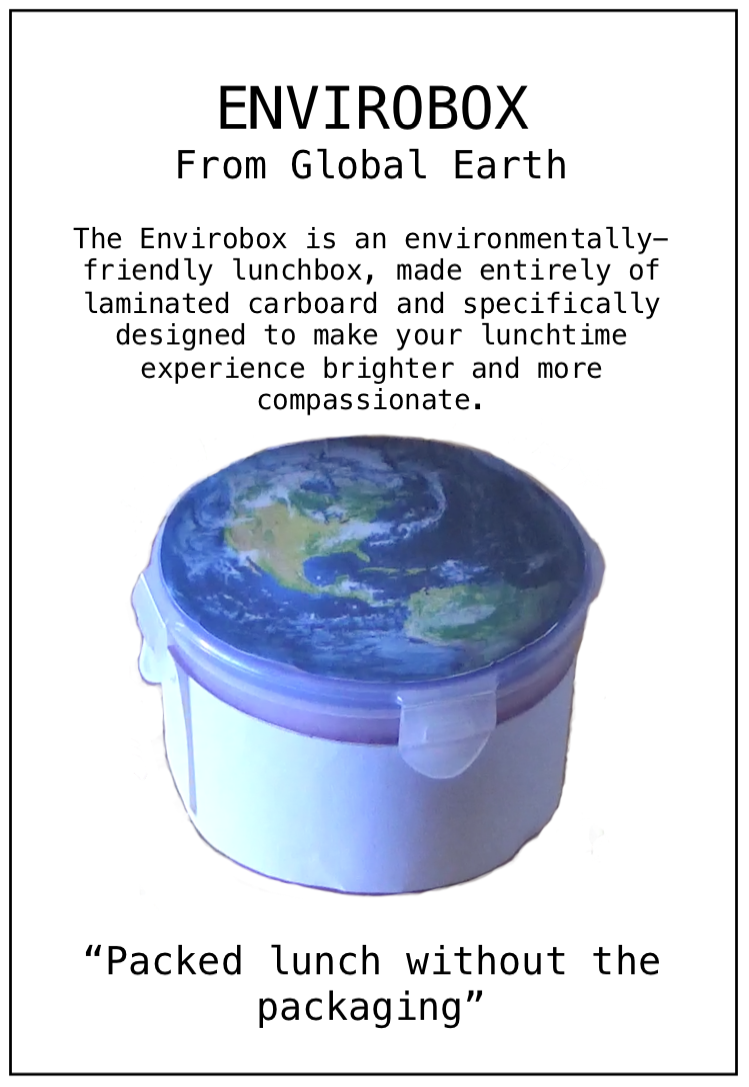
Since the flyer and newspaper advert are fairly similar, I will discuss them together. I think these print adverts are effective in interesting an audience because they are more formal than the audio-visual advert, which attracts a slightly different audience. I used a typewriter-style serif font, because this suits the type of broadsheet newspapers that the Envirobox adverts will be shown in. A serif font is more formal and sophisticated, which reflects the ABC1 slant of the target audience, as an audience would have to have a higher disposable income to invest in new technologies like this. I also used a large picture of the product, as this can break up a big block of text in a newspaper and stand out on the page, as shown in P4 above. Using this image also shows readers what the product looks like so they can recognise it in shops, and statistically people are more likely to buy a product they recognise if they are already looking for a new lunchbox. There aren't many circular lunch boxes on the market, so this already makes the Envirobox unique, and the printing of the earth on the top ties in the themes of being environmentally friendly and eco-conscious. The design is clean and simple, which makes it clear that this is a lunchbox for adults, since many lunch boxes are in bright colours and designs and are advertised towards children.
