P3: Develop an original story to be told within the graphic novel or comic
Title:
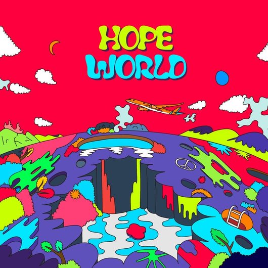
The title of my graphic novel is Hope World - stylised as hOPE wORLD. This is because the DNA extracting chip code that was sent out had a typo in it. It was meant to say "Hello World", but was misspelt as "Hope World", this error caused the glitching. Below is the album that I got the idea for the name from.
Synopsis and narrative structure:
Hope World is set in Britain 52 years in the future - the year 2070, in a cyberpunk reality. It is based on the history of the leprosy colony that existed on a Hawaiian island and a conspiracy theory I'm interested in about computer chips in humans going wrong. In this world it is law that everyone has to have a computer chip in them somewhere. The government says that this is to make everyone’s lives easier as your criminal records, tax info, driver's license, passport, etc. can be accessed more easily. But in actuality the company that makes the chips is extracting people's DNA and monitoring them, they then sell this data to advertisers so that they can tailor adverts to individuals, but both the public and the government don’t know they’re doing this.
For about a third of the population, their chips malfunctioned when a batch of DNA extracting code was sent out that had an error in it. So now those people have glitches in their body, and they are in the place where that person decided they wanted their chip.
The protagonist, Ten, has a glitch in her left arm and so the nerves in that arm sometimes have issues and the connections between nerves can sometimes not work when the brain tells them to, or sometimes the nerves fire off without the brain telling them to, creating muscle spasms. In everyday terms, this means that the hand can spasm, clench and unclench without the brain telling it to - or alternatively not move when the brain sends a signal to tell it to move.
Students at a British university discover that having a glitch can cause the skin of the surrounding area to rot, this can cause pixels from the glitch to transfer through bodily fluids, for example sneezing on someone. Therefore it is technically a disease. The government declare the glitch disease an epidemic. The chip company bribe human biology researchers to publish scientific journals that conclude that people with glitches are born with them due to genetic mutation and develop them later in life, and that it is an incurable disease. This means that the chip company have covered their backs as they are destroying the evidence that they extract people’s DNA and sell it. The government decide to deport people with glitches to a scarcely populated island, with no medical care or means of escape. They are basically sent there to die.
In the narrative of Hope World, the first issue starts with Ten going about her normal life with her glitch, and we discover that the glitch has been deemed a disease.
Genre
I have chosen for my graphic novel to be of the genres sci-fi and fantasy. It falls under the sub-genres of cyberpunk and biopunk. I chose these because people are becoming increasingly interested in the future of technology, and it is becoming increasingly likely that in my target audience's lifetime they will experience a cyberpunk-style future, where technology becomes highly intelligent and begins to control humans. So I think my target audience will find these topics very interesting as they are scarily close to being reality.
Target audience
The target audience of my graphic novel will be girls aged 15-19. In terms of disposable income, towards the younger end of this scale I will aim it at girls who's parents can afford to buy books for them, and towards the older end I'm aiming it at girls who have a part-time or Saturday job. My graphic novel will appeal to this target audience as it has a female protagonist, and there is a severe lack of female protagonists - especially in the comic book/graphic novel world. Therefore, my target audience will appreciate the representation of women, as if they are already a fan of comics they are probably used to reading books with not many female characters.
Main character
My main character is a 20 year old girl called Ten. She is know as Ten because her real name is Tanya, but her cousin was just learning to talk when she was born, and they couldn't pronounce Tanya so caller her Ten, and the nickname stuck. She has a full-time job as a 3D printer for engineering, and she hopes to work her way up in the company to one day manage the biomedical 3D printing department. She had a fairly standard childhood and teenage years, being a middle-of-the-road student with decent qualifications and an interest in retro technology (e.g. CDs, USB, cassettes, mobile phones). Ten was 13 when chips became a popular and accessible tool, and was 17 when it became law to have one implanted. Being one of the 30% of the population with a glitch, most of her current work friends also have them, as a lot of people are repulsed by glitches as they make people disfigured.
There are lots of additional characters in Hope World, but in the extract I will be producing it only features Ten.
Publishing company
The company I will publish Hope World with is Dark Horse Comics. I chose this publisher because they focus on publishing a lot of comics with darker themes to them - the genres they specialise in are horror, thriller, terror and crime. Although my graphic novel is the sic-fi/fantasy genres, I feel like the themes of corruption and segregation mean that it fits in with Dark Horse's style. Dark Horse also produce graphic novels that have a similar target audience to mine, so this means that people could find out about my story as they are already fans of Dark Horse comics in general.
Legal and ethical issues
This graphic novel will be entirely my own work, so I am responsible for making sure I don't infringe copyright. I will make sure that everything in my novel is made by me, or that it is from a royalty-free source. The main copyright issue I have to worry about is putting copyright on my work so no one else can use it without my permission.
Another issue I need to consider is libel. My work will not be libellous as it is a work of fiction, and all my characters will be original to my story.
In terms of representation, I want my main character - Ten - to be a fair representation of women. I aim to show her as a typical 20-year-old, so I will not conform to stereotypes that are incorrect and/or damaging to women. However, she will conform to some stereotypes so that she is more relatable to my target audience. Since my target audience is ages 15-19, Ten will not conform to the male gaze theory as this is damaging to young girls' self esteem to show women as objects to please men, but also because this would be inappropriate for the age group.
Although my graphic novel covers some dark topics like segregation and discrimination, I will not include any language or actions that will cause offence to the reader or that would be insensitive. My graphic novel will not in any way glorify hate crimes against any group of people, this content is just included to show what awful things can happen if a group of people are cast out from society. Since Hope World is aimed at older teenagers, I will be including some violence, graphic scenes and bad language, but not excessive amounts. I feel like it is justified to include these things because it fits with the other media products my target audience consumes, i.e. 15 rated films can include lots of violence and bad language.
Leading on from this, I also need to consider regulation of my graphic novel. The CCA (Comics Code Authority) used to be used by most publishing companies to check that their comics had no content that is inappropriate for children. In recent years however, most well-established companies have created their own regulatory codes and the CCA was dropped. I plan to publish my graphic novel with Dark Horse, and they are actually one of the few major American publishers of comic books never to display the CCA seal on its covers. Hope World fits with this fact, since because I plan to include violence and bad language it won't be suitable for children. Although, it would be a good idea to have the first page of my graphic novel be a warning stating what content is included in it, so people know that it isn't suitable for children and they are able to make an informed decision about if they want to read/buy it or not.
P4: Create a script for the planned story
Below is the script for Hope World.
Hope World Script by Beth Rands on Scribd
P5: Plan the structure and panel layout for the proposed organic graphic novel or comic
Below is a slideshow of the page layouts I will use for my graphic novel.
|
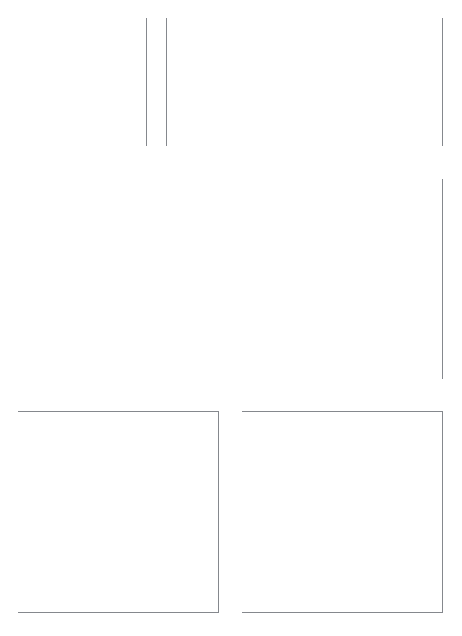
The first page has 6 panels: one large panel at the top, a row of two and then a row of three. I chose this layout because it would create a build up to introducing the main character, rather than showing her front and centre in the first panel. This first page has no dialogue or sound effects, I wanted to do this because then the reader will focus on what's going on in the panels, rather than just the words. Although we don't see Ten's face until the 4th panel, I think I have made it obvious that we are seeing the main character because revealing the protagonist in the first page is a convention of graphic novels and comics. The first panel is an establishing shot of the street that the CD shop is on, it is late in the evening and there aren't many people around. The second panel is a worm's eye view of Ten's feet at a display stand. Panel 3 is a medium shot of Ten with her hands in her pocket, her glitch is introduced in this panel as I want to establish early on that this is something that controls Ten's life - hence why it is shown before her face. Panel 4 is a medium shot of Ten's face, she has her coat hood up and is looking at the CDs. The fifth panel is a shot of the CD display case, there is a sign next to it that says "2020's Pop only 3 for £2", I used this shot to establish that this graphic novel is set in the future, and also to show the reader that CDs are outdated and are the equivalent of vinyl to us. The last panel is a medium-long shot of Ten browsing through the CDs, we can only see her back. Props on this page are only the CDs.
|
|
The second page has only 3 panels: a row of two and one large panel at the bottom. I chose this layout because there is quite a lot of dialogue, so not much is changing in the scene and I can include quite a bit of text in each box. The purpose of this page is to set up the premise of the graphic novel, and to casually fill in the audience on some backstory. The first panel is an over-the-shoulder shot of Ten and the shop keeper talking about her arm. The second panel is the same shot of the two characters talking, except moved further down the panel to allow more room for dialogue. The third panel is a close-up of the CD on the table, the two characters finish their conversation in this panel. The main prop in this page is the CD.
|
|
|
The third page has 3 panels: one big one and two long vertical boxes. I chose this layout because this page contains backstory to how Ten got her glitch, so there isn't much action happening. These panels will show Ten walking home from the CD shop and going to her university dorm. The first panel is an extreme long shot of the CD shop, it is very small and old fashioned compared to the huge modern buildings next to it. In the second panel we see a rat drinking from a puddle of liquid that is leaking out of a neon sign - this is to show the audience that this isn't a nice part of town. This also conforms to the conventions of dystopian cyberpunk. The third panel is another extreme long shot of Ten entering her dorm, the building is a block of 20 apartments.
|
|
The fourth page has 6 panels: a row of three, one large rectangular box and a row of two squares. I chose this layout because I wanted to spend a whole page focusing on Ten to help the audience connect with her more, I also want to create an eerie tone by having lots of panels with no text to reflect the cyberpunk sub-genre. The first panel is a close up of Ten unzipping her coat. The second panel is a shot of Ten's feet walking across the room. The third panel is an over-the-shoulder shot of Ten sitting down at her desk. I wanted to include these panels to create a build-up to the fourth panel, as this will make the audience be focused for what is about the happen. The fourth panel is a shot of Ten's glitch, this is shown in colour so it will stand out as the rest of my graphic novel is in black and white. I wanted to include this shot so that the audience doesn't forget about her glitch, as Ten always knows it's there, so the audience should be aware of that too so they can empathise with her more. The fifth panel is a close up of Ten looking upset and worried. The sixth shot is another close-up of Ten holding her arm as if it hurts, this will make the audience feel sorry for Ten as the glitch isn't her fault.
|
|
|
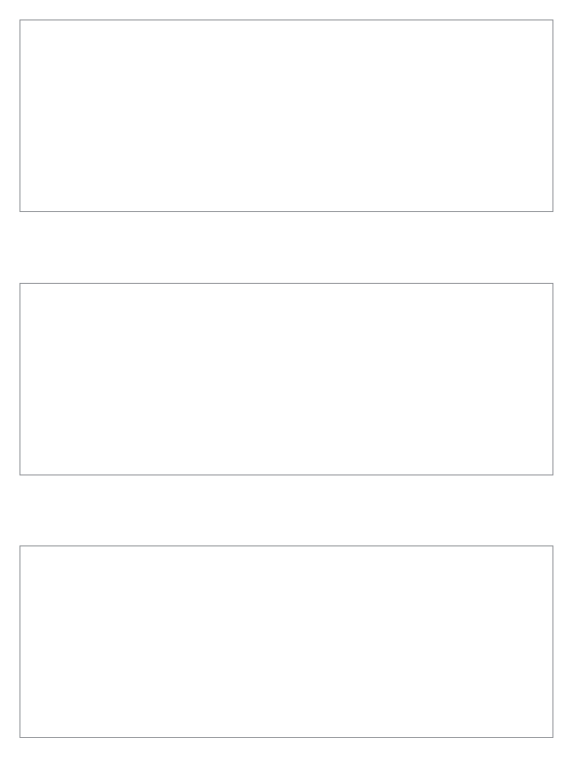
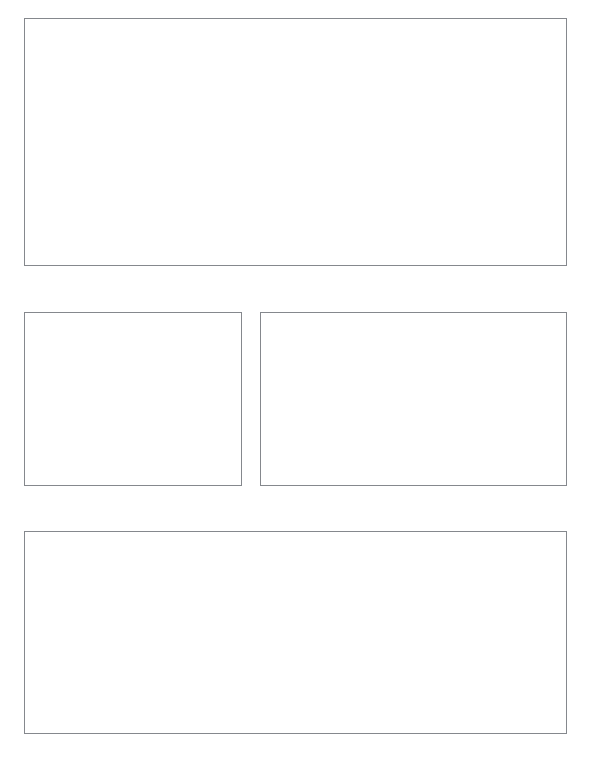
The fifth page has three large rectangular panels. I chose this layout because this page is all narration, so the action going on needs to fit with the text. The purpose of this page is to move the story along more, because the equilibrium section is not the section of a narrative that is focused on, so I want to move the story on to the disruption of the equilibrium. The first panel is a long shot of Ten at her job, operating a 3D printer, this fits with the text as the narration says that she is scared she might lose her job. In the second panel we see Ten on the underground, the other people travelling on it are avoiding her and giving her weird looks. This fits with the narration as it says that people started to be scared of those with glitches. The third panel is a long shot of a front door left wide open, the apartment inside is empty. This fits with the narration as it says that people were disappearing.
|
|
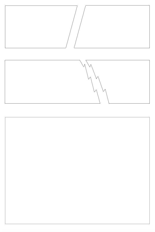
The sixth page has five panels: two rows of two and one large box. I chose this layout because this page is where the action starts, so I wanted to have a more exciting top row with the diagonal lines, and I also wanted to have room for a full-body shot of Ten in the last panel. The purpose of this page is to start the second narrative stage - the disruption of the equilibrium. The first panel is a close up of Ten putting her bag down on the floor, this is to help set the scene and add some context. The second panel is a close-up of Ten's phone ringing as it lies on her desk. The third panel is a shot of her picking up the phone - hence the zig-zag lines to separate panels 3 and 4. Panel number 4 is an over-the-shoulder shot of Ten's mother telling her that her sister has gone missing. The last panel is a long shot of Ten lying on her bed, she is lying on her stomach and crying.
|
|
|
The last page has 4 panels: two large rectangles and two smaller boxes. I chose this layout because more action is starting to take place, so less boxes are needed as it is a lot more fast-paced. The first panel is an extreme long shot of Ten walking down an alleyway, she explains in the narration that this is where she used to live when she was hiding from the police. The second panel is a long shot of Ten talking to a man sleeping in the street and asking if he's seen her sister. The third panel is a shot of Ten outside a bar called The Snake. The last panel is a long shot of Ten sitting on the curb with her head in her hands.
|
This is the last panel I will produce because I want to leave this sample on a cliffhanger, as I could release this for free to get people interested in my graphic novel, and they can have a look at it and decide if they want to buy the entire first issue. I feel that I have set up the story well, and I have left out enough information that the reader will want to find out more.
Design of Captions, Font, Speech Bubbles, Lettering
|
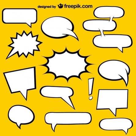
A large part of the text in my graphic novel is narration, since there is a lot of backstory to explain. Therefore, I will use a plain black square box to show when Ten is thinking and when she is narrating a scene. This is because the rest of my comic is in black and white, so black box outlines will fit in well with this theme, also this type of box fits the conventions of comic books and graphic novels. When a character is talking, I will use traditional speech bubbles with a plain black outline - as this is what comic book readers expect to see, so it won't distract from the narrative. I think my target audience will like this design because it is minimalistic, whereas if my graphic novel was aimed at young girls I would use lots of bright colours - my plain design is more mature.
|
All my dialogue will be in the same font and will be in all caps throughout. I chose this because it looks the most professional and it conforms to the conventions of comic books and graphic novels.
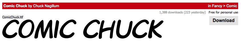
This is the font I have chosen to use.
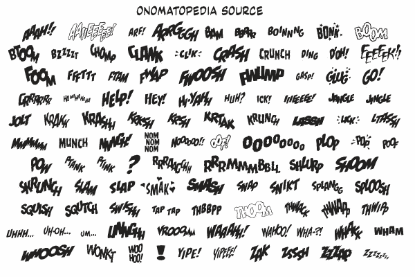
In terms of sound effects, I want to use a style similar to the examples below. I want them to fit with my black and white theme, since Hope World is a more mature graphic novel. It would be too childish to use lots of bright colours like the traditional comic book onomatopoeias, so I want to use something more plain and mature for my graphic novel. I definitely want to include onomatopoeia in my novel because it is a convention of graphic novels, and it also adds to the visual narrative of the story, as the reader can quickly get information about what is happening in the panel.
M1: Produce a storyboard to illustrate the flow of the story
Below is my storyboard.
Unit 9 Storyboard by Beth Rands on Scribd
D1: Evaluate the feasibility for further development of the main character in future stories across different media formats
D1 by Beth Rands on Scribd
It is very feasible that the storyline of Hope World could carry on after this issue. The sample I will be producing is only a short extract of the story I have planned out so far, as described in P3. However, I think that storyline could take up the first 1 or 2 issues of the graphic novel, and there are lots of loose ends that could be tied up in future issues.
In terms of the storyline, I would like to explore how characters react to the deporting and show different reactions from non-glitched people, from other countries and from political leaders. There is a possibility I could even have two separate timelines and follow the life of someone with a glitch on mainland Britain trying to avoid being deported and living in hiding. I would also like to develop more of a picture of what life is like in 2070 in terms of technology, politics, society, medicine, etc. because then my audience can become more immersed in the world I have created. Other areas of my storyline I could explore are: what life is like on the quarantine island and how glitches effect different people. I would like to show how the placement of a glitch in the body effects a person's appearance and quality of life, e.g. what happens to you if you have a glitch in your chest or head?
When it comes to characters, I think this is the most un-developed part of my graphic novel so far, so it is very important that I introduce more major characters and develop them so that the audience can feel connected and a part of the story. I would like to have Ten's sister Fizz be the secondary character for a large portion of the story because she has known Ten her whole life, and there are lots of potential for plot points about their sibling relationship and how their deportation puts strain on it. In terms of character development, I want to explore the different aspects of Ten's personality, and to show a dark side of her when she is pushed to the edge. I also have ideas for which characters I don't want to introduce, specifically characters within the government/chip making company. I want these characters to be anonymous because I think this makes them more sinister and threatening if the audience just sees a faceless corporation.
I think my graphic novel has a lot of potential to be developed into a TV show, however the type of show it would be depends a lot on budget and the success of the original graphic novel. I have already chosen to publish my novel through Dark Horse Comics, and a few of their comics have had TV shows created based on them - here is the list: en.wikipedia.org/wiki/List_of_television_series_based_on_Dark_Horse_Comics. Both live action and animated series have been created, and ideally I would like my TV show to be live-action so it could have a similar feeling to Blade Runner 2049. However, this is not very likely because a huge budget would be needed to put in all the glitches with CGI, especially as this is the main focus of the show so glitches will appear very often. To have the budget to achieve this, the TV show would have to be made with a production company like Lionsgate, 21st Century Fox or Universal, as these are some of the biggest production companies so they have lots of funds. Dark Horse Comics also have their own film and TV production company called Dark Horse Entertainment, but they have needed help from other producers to make all of their previous TV shows and films, which suggest that they don't have a very big budget for their productions.
I think an animated TV series would work well for my graphic novel because a simple art style similar to the original novel would be easy to animated - compared to a hyper-realistic style like Avatar. However, I think an animated series wouldn't be taken as seriously compared to if it was live action because animations are seen as being for children but my novel deals with very mature themes, so I feel like this would put off an older teen target audience. Similar to series like The Walking Dead, I think a TV adaptation of my show would be most successful if it didn't follow the exact same plot as the graphic novel because this would make it more exciting for existing fans of the graphic novel, rather than knowing exactly what was going to happen in the plot. Lastly, I think a TV adaptation would work best being shown either on Netflix, or on the TV channel E4 as they have a target audience of 16-35, which fits in with my target audience.
I don't think Hope World has much potential for being turned into a video game however, as it is very story-based rather than action-based. A lot of successful game adaptations focus on the action/fighting aspects, for example the Star Wars video game. However, the company Telltale Games has produced many story-based games that have become popular because of the decision making aspect of the game, there is very little playable action in these games which would fit with my graphic novel very well. In my opinion, a simple phone game would be more successful than a game for PC/Xbox/PS4 because there isn't enough playable action to pad out a full game for consoles, which normally takes an average of 30-60 hours to complete. Whereas phone games don't normally have a story to them and are normally platform games, these kind of phone games also tend to be popular with teenagers and young people as they are very addictive, so this would appeal to my target audience.
