P5: Carry out post-production techniques and processes to produce a final original media product in line to the client brief
Below is my offline edit.
Below is a video of how I added the text to my video.
Firstly I opened the Titles Browser and found the text I liked the look of from the font video I made for P2. I dragged this onto the timeline at the beginning of the video. I typed out my opening title, and changed the font to the one I liked in the P2 video. I then changed the size of the text and moved it to the centre of the screen. Then I cropped the text clip so that it would finish when the first clip ended. Next, I opened the Transitions Browser and dragged a dissolve transition over the text so that it would fade in and out. I then played around with the settings for the face, outline, glow and drop shadow of the text until I liked how I looked. I changed the colour of the glow, the distance of the shadow and the size of the glow, along with other settings.
Below is a video of me editing my clips to the correct dimensions and camera movements.
First, I dragged the imported clip of the painting down into the timeline. Since I took this picture on a different camera to my videos of the market, it had different image dimensions, so in order to make it fit the screen I need to zoom the image in. I then changed the anchor for the X axis so the image is centred. Next I made the clip shorter so it is the length I need. I then dragged the cursor to the beginning of the clip and added a keyframe to the anchor. I changed the anchor for the Y axis so we can see the bottom of the painting, since I added a keyframe the software will remember to have the anchor at this point for this specific frame. I next moved the cursor to the end of the clip and changed the anchor for the Y axis so that we can see the top of the picture. Since the end of the clip is also automatically keyframed, the software will move the Y axis from one set point to the second over the length of the clip. This creates the smooth pan shown in the final few seconds of the video.
Below is the first draft version of my full video.
After showing the above video to my target audience, they told me that it would be nice to see a different transition other than a cut and fade to black, perhaps to separate the fist and second half of the video at the different locations. They also suggested that I linked it back to culture at the end of the video, just to remind the audience of that aspect of the video.
Below is my final video.
I think my final video is suitable for my primary target audience (judges at the culture awards) because I think it is very professional. I think I show Cambridge in a positive light, and show it as a city that welcomes and caters for many different cultures. My video shows that in the museum, there have been many cultures celebrated in Cambridge for many years, and that Cambridge values the influence of different cultures - since they collect foreign artefacts in the museum. At the market, I showed that people who live in Cambridge appreciate the food from many other cultures. I also showed that many of the people who live in Cambridge are not British, and so they appreciate being able to buy their home country's food.
In terms of strengths, I feel that the video flows well, I feel that the shots change not too fast and not too slow. When I asked my target audience for feedback, they said that the voice over can be heard clearly over the background music. They also said that they liked the upbeat background music as it fitted well with the tone of the video. In terms of improvements, they said that I could link the video back to culture at the end in some way, and I could also add in a few different transitions. I then improved these things to form my final video.
If I did this unit again, I would be more adventurous and visit a wider range of places in Cambridge. I think it may also make my video more interesting if I showed where these places were on a map so people can visit them. An animation feature of a map would make my video much more engaging and would encourage visitors to explore other sites around the city. Captions to say what the artefacts are and what the stalls are would also improve my video, particularly for visitors who don't speak English as a first language, as it is often easier to understand written text rather than spoken words.
M4: Demonstrate how the exported media product meets the client brief
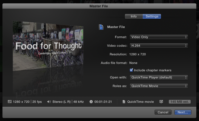
Below is a screenshot of the settings I chose when exporting my final video.
In the professional world of media, I would send my finished product to Cambridge City Council in many different file sizes, so that they have as many options as possible. I would send them the highest possible quality, so that they can submit this in the regional culture awards. I would also send them a low quality version, and three different medium-quality options in between.
I chose to use the format H.264 because the file size is very small and the quality of the picture is exactly the same as with other file forms (they are all 1280 x 720 and at 25fps). This is the version that went on my blog, as it is the best size for uploading to YouTube. The Cambridge City Council would want the video uploaded to YouTube because this is the easiest way to share and view videos, and it is also free so the council don't have to pay to use it. YouTube is also well known, so most people know how to use it. Additionally, you can upload videos up to 4K in quality, and users can choose the quality of the video from 144p to 1080p or even 4K, so it can still be viewed on slow devices or weak internet connection.
The regional culture awards would want a very high quality version to be shown on the big screen, so I would use Uncompressed 8-bit 4:2:2, this is because this file is uncompressed so the image is its full size. However, having the video in this form would be a size of around 4GB. Cambridge City Council may want a medium quality version for the website so I could use a form like Apple ProRes 422, this would be around 800MB in size. I would choose this because it is a medium-sized file, so people can watch it on their website even if they don't have the best broadband speed. The council may also want a low quality version to be put on their Twitter or Facebook page. For this I would use Apple ProRes 422 Proxy because this format has the smallest file size of around 300MB, so it will load on small phone screens.
I feel that I have met the client brief with my final product because I have promoted Cambridge to people who may want to visit. The brief states that the video must "promote the range of cultures that are part of each city's unique identity." I feel that I have met the brief in this sense because I have shown how other cultures have been a part of Cambridge for centuries through artwork, and I have also show how in recent years more cultures have become a part of what we know to be Cambridge, as shown through the market. The brief also asked for a product with the primary purpose of promoting Cambridge, and I think my video does that as it shows Cambridge in a very positive light and makes it seem welcoming to the audience. I think if people watched my video they would want to come to Cambridge and experienced the things advertised for themselves.
D1: Analyse how post-production techniques and processes create meaning in the media product to meet the client brief
One technique that I used is graphics and titles at the very beginning and the very end of the video. By using graphics and titles, the target audience will feel that my promotional video is professional and memorable, therefore they will be more likely to visit Cambridge as the promotion has kept it front-of-mind. This enhanced my final video because the graphics at the end link my video back to being about culture, as the client brief states that my video must be centred around culture. The text in the titles also use a sans-serif font so this appeals to my younger target audience (imaginary entity described in proposal) as it is more informal. The text also links my video back to the fact that the video is about Cambridge, and this engages the audience. Slogans are a convention of promotional videos, so I included the slogan "Cambridge, City of Culture". This also uses alliteration, so people are more likely to remember it. By using graphics and titles, the target audience will feel that my promotional video is professional and memorable, therefore they will be more likely to visit Cambridge as the promotion has kept it front-of-mind.
Another post-production technique I used is the dissolve transition, I used this technique to make the text on screen fade in and out. This enhanced my final video because it made the text elements appear to flow more, rather than just being straight cuts on and off screen. In the M1 section of my proposal I stated that I would make my video as professional as possible. With this in mind, the dissolve transition was a good technique to use because it is more complex. By creating a high quality product, I have made Cambridge seem more appealing as the audience will be impressed with the professionalism of my video, therefore meeting the client brief as well. In a promotional video, it should be very clear what you are trying to promote, so I used a fade to black as my final shot to emphasise that the secondary purpose of the video is to get people to visit Cambridge (as the primary purpose is to win the Cambridge Regional Awards). This fade to black is also a convention of promotional videos, as it makes them more cinematic. This transition makes the audience feel that the video isn't properly over as the music and visuals simply fade out, so this makes them feel that they should continue the story by visiting the city themselves.
I also used the bloom transition to separate the museum section and the market section. I think this makes it visually clear to the audience that we are moving to a different location, so they aren't confused about why the scenery has suddenly changed if they are watching the video without sound, or have hearing issues. I also wanted to make this changeover more interesting since I used straight cuts for every other transition in my video. A variety of transitions holds the audience's attention and shows that the video has been created by a professional, allowing them to feel that this is an opinion that can be trusted. In my proposal I stated that "I want to use mostly straight cuts, but I will probably add a few dissolve transitions and possibly a fade to black", so by sticking to this plan I have also met the requirements of my proposal.
At the beginning of the video, I used a white and blue glow for the text. I feel like this has a positive impact on the audience as the white implies that Cambridge is a positive and perfect place to be, as white connotes goodness and holiness. Also the blue connotes peace and strength, plus blue is the official colour of Cambridge University. I said in my proposal that "I want to create the feeling of the city being full of life, energy and productivity, but also not too stressful", and so I feel that these colours meet the requirements of my proposal. By picking these colours, I have portrayed Cambridge in a positive light, so I also meet the brief requirements by promoting Cambridge, along with enticing the audience to visit the city.
